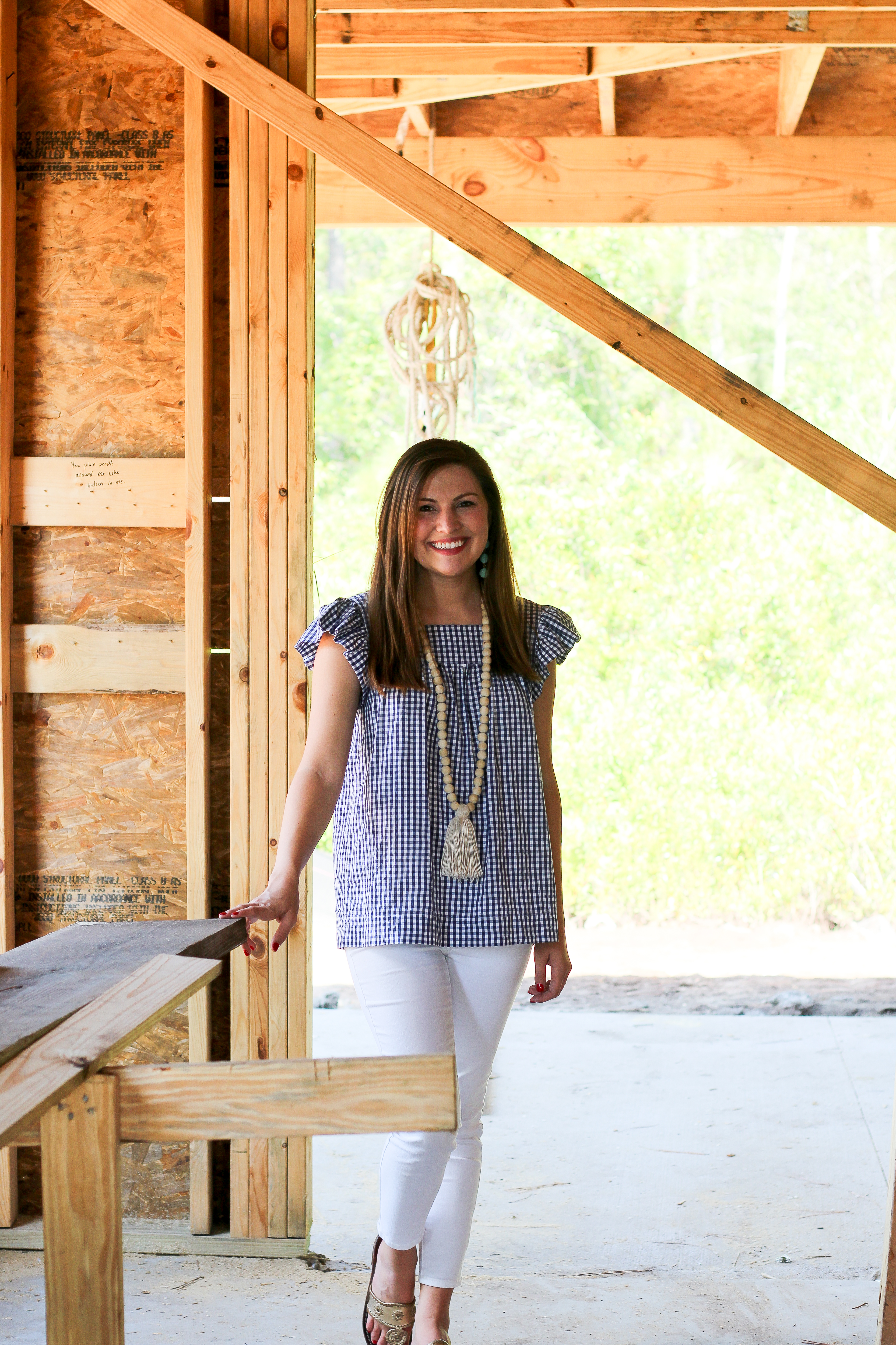
We’ve officially wrapped up the design process for #TheFussellHome and let me tell you, as exciting as it was… it was also a lot of work and a LOT of decisions. Thankfully we’ve made all of the big decisions and now it’s time to sit back and let everything fall into place! I had a really good idea of what I wanted going into the design process and I knew what Pearce did NOT like in terms of decor and design, so we went from there. Our drawing board started out as a few Pinterest boards and quickly turned into marble, tile, + fabric samples and photoshop mockups as soon as I realized I needed to come up with an actual plan of attack (furniture, drapes, wall color, wood color, countertops, the whole sha-bang!) for an open floorplan. Once we made the really big decisions (flooring, counters, colors, etc.) we started filling in the blanks and our builder’s interior designer helped guide us through the steps to bring our vision to life!
So here’s what we went with and a bit about our “game plan”:
Carrara Marble Countertops – I have loved these pretty countertops since the beginning. They make me feel like I’m in a really cool coffee shop but also like I’m a princess? Something like that. They’re classic, clean, and absolutely stunning! When I learned that they required a bit more upkeep I found a few quartz options that looked similar but kept going back to the marble. As of right now, I’m feeling pretty darn confident that I’ll be able handle the maintenance and love these counters as long as we live in the new house! If you’re debating whether or not to take the plunge, these articles really helped me make the decision – here and here.
My favorite quote from article #1, “I personally would advocate taking a Myers-Briggs personality test before being able to purchase marble.”
White Shaker Cabinets – This was truly a no-brainer for us. I wanted bright white cabinets with clean lines so that’s exactly what we did. You can see our original cabinet inspiration photo here. I think know (confidence is key!) they’ll look great with the marble and lighten up the kitchen (especially with the dark floors we chose). Because the kitchen, dining room, and living room are really all one shared space, I felt it was really important to keep things simple and airy. We chose hardware that looks like this (the drawer pulls, not the knobs) and I can’t wait to see how it turns out.
Light Gray Walls – I thought we’d end up going with white walls instead of gray but unfortunately our builder had a VERY limited selection and I was nervous they’d end up ivory or yellow so for now, we’re going with gray. I’m still pleased as punch with the color we selected so all is well! The only photos of the paint color I could find on the internet can be found on this lovely blog. I think it’ll be perfect with all the white accents in the main living spaces.
Subway Tile Backsplash – Because we ended up painting the walls gray instead of white, I wanted to add a little more white in the kitchen (my anti-white husband is the sweetest thing for letting me get away with this!!!) so we went with a classic Subway Tile backsplash with clean white grout. Instead of the traditional horizontal placement, we’re having them lay the tile in a herringbone pattern (like this and this) to give it a little more “oomph.” I originally saw the idea on Fixer Upper and fell in love!
Silver Accents – I really, really love gold & brass accents in the kitchen but because we’re not going to live in this house forever we went with silver light fixtures and hardware for the sake of future buyers. I still plan to throw a few pops of gold in the living room + dining room (see barcart) but the main pieces will be silver and nickel. I’m totally okay with that because they’ll pull together the classic, coastal, southern feel we’re going for. And how fabulous are these pendant lights?! They’re going to look lovely over our island.
Rustic Farmhouse Table – I’ve searched high and low for the perfect natural wood dining table and honestly, I’m still looking. I really like this farmhouse table Target has available right now and I’ve even had a few bloggers recommend it. The thing is, this is our TABLE. We’ll probably keep it for a loooong time and we’ll definitely enjoy lots of happy meals and laughs around it. It’s a big decision and I don’t want to rush into anything, so while this one is extremely affordable and most definitely in the lead right now, I’m just not 100% sure yet. We will definitely need a natural wood table to balance out my ultra chic lucite ghost chairs. These were my inspiration photos for the chair + table combo: this one, this one, and this one. I feel like it’s the perfect his/hers combination.
Dining Room Art – This was the most exciting decision we’ve made yet for our new home. We fell for fine art on our honeymoon and we’ve been discovering incredible artists ever since. Art adds so much personality to a home and it’s my favorite way to add a pop of color. We wanted a large piece for our dining room but fine art comes with a mighty fine price tag. My grandmother recommended we purchase art prints of the originals instead of investing in canvas pieces right away. So I was thrilled when I discovered the talented artists on Minted and the affordable rates for prints + framing! Minted so graciously sent me this stunning art print (more details coming soon!) by one of my favorite artists, Katie Craig and I am in LOVE. We chose the Whitewashed Herringbone frame – best decision ever!


